Monday, 16 December 2013

Do we necessarily need to meet only in a room?

So after having anylised all these projects and the different appoaches used by architects in different times, my provocative question is: do we necessarily need a only in a closed room to stay together? To make people meet and create social connections among them? We are what we are due to the space surrounding us and not living it and keeping it outside from our door can just deprive us of a sense of space and community, the strongest link to people.
Why don't we think about communication conntections like a grid to resolve this issue? It would be so easier. The problem today is that cities are becoming more bigger everyday and due to this velocity we forgot to make these connection grow with the city. We simply cut them off and this is why it's so difficult today to find a place to meet together. Communal spaces shouldn't be only banished like spots in a map. They should be all linked to form a grid, like a green grid.
And the project for the High Line in New York, a 2,33Km line built in 1930s and abandoned in 1980, is an example of a new possible approach. The project of requalification of the line as a urban park has been designed by Diller Scofidio+Renfro architects of the landscape architecture studio James Corner Field Operations in 2002 and started to be built in 2006.


SOURCE: http://lifeblog79.blogspot.co.uk/2012/04/highline-park-of-new-york.html

Like it is possible to see from the pictures the floor follow the pattern of the rail line and where there isn't a solif floor there is vegetation and seats. This line passes through the city at a certain high and, not on the ground level. And sometimes it is so closed to the buildings that looks like a private terrace of the building or it just passes literally through a building. The contact is so narrow that it's impossible to not have a relationship with this line, because it connects places, people and give them different views of the city.


Sunday, 15 December 2013

Going all outside!

But it's not necessary needed a closed spaced to stay together, neither a room, nor an integrated communal space inside the building. We have to think outside the box and this is what the studio Tegnestuen vandkunsten did in 2003 with the Copenhagen Harbor Housing Project, in Denmark.

The project consists in 120 apartments, and again we can find here the mix of private and social housing apartments. Fact that can only help to support a social connection and to break social barriers. Among the requests of the client there was boosting the development of this parto of the harbor and to make everything easier the site hasn't needed to be paid.


So the key of this project has been designing and building the compound as an artificial island and so invading the canal. In this way the arroach to the sea is not passive at all. The buildings are located plumb to the canal so that the spaces between them are invaded by water. Almost each part of the buildings is prefabricated concrete at which a balcony system in steel is attached to reach every apartment. 

But the the very interesting thing for me is the fact that they designed these spaces thinking to make people live them not in a passive way but in an active way. So the ground floor facing the canal is completely porous and free to pass through and people can stay in this space and enjoy it and the view. People can swim, fish and kayaking and even have a barbeque and parties. This space is completely open for anyone so this makes it more interesting, like if it was a meeting space, a square, and this obviously attract people.
In this way people living in these compound don't need to meet in a closed room to stay together but can just go outside their house and live nature and open space and be more connected to life. Saying this, therefore, I'm coming back to my introduction about town squares and saying that what really make people meet and connect with others is the space around them and these connections are possible just when there is a grid supporting them. The key is trying to not interrupt this grid.


Saturday, 14 December 2013

Sharing a space

So when I'm talking about shared spaces, starting from a local design, a good example to describe this kind of approach could be this project of apartments in Madrid by the studio ACM Arquitectos. The building consists of 82 apartments, each with a different colour to the next one and with, more or less, the sme size, since they are all like containers. These containers are located in this quadrangular form with a big courtyard in the middle. The all building looks really porous due to the fact that every apartment has a gap spage between it self and the next to it. The same is for the ground flloor where there isn't a unique closed belt but this rule continues to exist. Only along the shorter edges of the rectangle there aren't apartemnts and the space is designed for services like staircases, lifts and entrance gates. This gates give a direct access to the big courtyard in the middle that has been designed as well.


Miguel de Guzmán
Totally there are 10 lift+staircases towers to make it possible to reach every apartment easily. This big number of lifts is due to the fact that there aren't corridors, neither inside nor outside the structure of the complex. In this way each lift is of service for two apartments of each floor, so eight apartments in total.
But coming back to the porous characteristic of the building, the question is: what is the purpose of this open and shared space? This space is not only like a shared landing serving two apartments it is also a way by which it is possible to create communication and relationships starting from a small link. In this space kids of each familiy can play and stay together and people can meet as well and use this space also like a storage space or like a terrace. The fact that this space is open has not to be understimated: in fact people meeting in this space can, at the same time, look to other people meeting in these kinds of space so that this situation is not merely individual but involve others. Furthermore on the top level this space has no ceiling so that the shared landig becomes a terrace for the summer.
In addition the fact that each apartment has a different colour creates a differentiation and individuality that help to have a serene atmosphere and to not loose people personalities. As it is possible to see from the plan there isn't a big variations in the plans of the apartments. But the light material helps also to see everything lighter and inside each spaced is studied very well. But this communication between flats and people doesn't need to be necessarily so closed, it can be more open.


David Frutos


Miguel de Guzmán

Friday, 13 December 2013

Starting from a local design

So when I talk about "integrated communal spaces" I'm talking about spaces designed while the project it self was designed. This means that the architects really wanted to create a connection among people an that they made this like the key word of their project. This is very similar to what happened with the "Villaggio Matteotti", Terni, Italy, designed by Giancarlo De Carlo in 1970-1975. 
It consists in around 240 apartments and it has been the first italian example of a design born from the involvement of users. The complex is like a "village", in fact the street between each line of buildings are mainly pedestrian and cars can just pass along the perimeter of this area. Every single row of apartments is linked to the next one by a double route. One, visible in this picture, is higher and it consists in these sort of small bridges. The other one, not visible here but only venturing in the "village", is on the ground floor level: in fact there are some points in wich each line is passable.


SOURCE: http://architettura.it/books/20081207001/index.htm

The section of the street is very narrow and the balconies look like invading the street with them selves and through nature. In this way there is also a dialogue between apartments in front of each other and between them and who passes through this path. Each bridge, connecting the rows, is connected to a staircase that gives an easy access to all the complex: in this way there is no need to circumnavigate the complex to reach the first staircase. But this is also allowed by the possibility to passthrough each line by a pedestrian passage. This pedestrian passage is not hermetic but in some cases, there are doors, terraces, passages and apartments facing on it.So that when you pass through it, is like passing thriugh a semi-public space. This sense is marked by the fact that very often you can find carpets or stuff of owners.
But to make this passage possible, it wasn't enough creating it. The architect had to add something by which inhabitants would have felt the need to pass though them. This has made possible adding a series of services like a kindergarten, shared open terraces, rooms to meet, play together and drink a coffee and a mini supermarket. So the question is do these connections necessarily need to be only horizontal?


SOURCE: me


SOURCE: me

SOURCE: me


SOURCE: me


SOURCE: me


SOURCE: me

Thursday, 12 December 2013

Integrated communal spaces

Between 2004 and 2005 the architecture studio A2 and Freising designed this social housing project for the Ackermannbogen in Munich, Germany. It is composed by 53 apartments, offices, a cafè, gardens, communal terraces and communal spaces where it is possible to stay together and, for example, have parties for kids.

It is mainly a linear building with an attached balcony system needed to reach each flat. Each floor is reachable by a lift, exept for the first floor that has an own staircase. This attached structure is modular so that it's possible to add and take off or just move added spaces. These spaces are all attached to the corridor being of service for the flats and they are used as semi-private balcony since everyone can reach them and stay there. At this structure there is a huge wisteria plant running thrugh it. Maybe one day it will be possible to have shadow on this facade due to the wisteria plant. 

Going on the top of the building it is possible to find communal spaces where every inhabitant can meet with others and stay together in the same space, sharing it.


SOURCE: me

The facade is articulated in three different colours to give rhythm to it and also divide the duplex flats. In detail, looking at the facade it is possible to see the pannels of the walls. In fact, as a social housing project, they tried to build it in the best and cheaper way to limit costs then. In these kinds of projects, generally, they try to design apartments on the base of people needs so, if you are old, they would prefer to design your flat on the ground floor so that it can be easier for you to reach your home. At the same time a ground floor apartment can be used by a student that can serenely live there, maybe in a smaller flat.
But the good idea of these projects, what make them work, is the fact that they try to mix people who are buying the flat and people who are renting it with a facilitated price, due to economic own conditions. So this fact, together with these communal designed spaces, creates a community sense because they can share spaces, hobbies, breaks, they can make their kids play together and so on.
An other example, a bigger design with more connections is the villaggio Matteotti.


SOURCE: me


SOURCE: me

Wednesday, 11 December 2013

Bringing the social activity upstairs

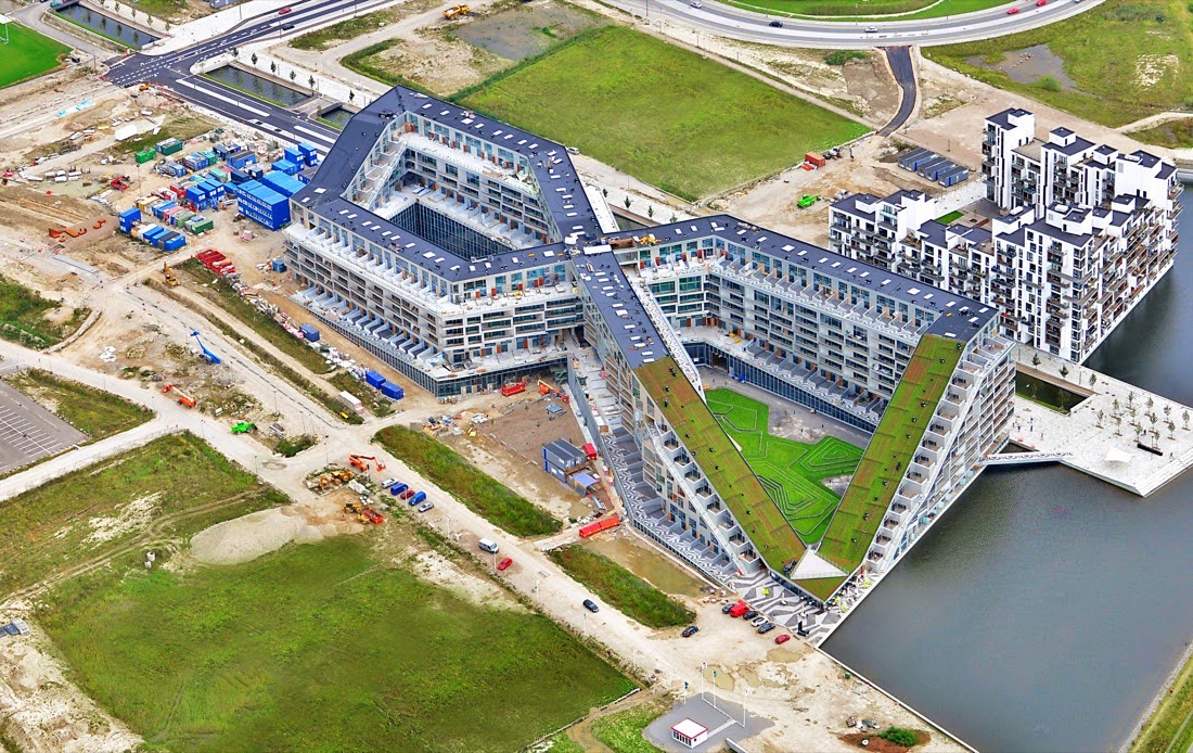
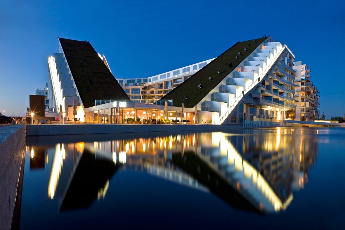
In 2010 the famous architecture studio BIG did a project in Copenaghen (Denmark) consisting in around 480 housing flats. The main point of the design of the 8 House was trying to manage to develop it so that every function was located in best way keeping in mind people needs and behavior and, obviously urban contest and views. The key used by the studio to resolve this task has been starting to locate every function in the easiest way, having: the shops and offices on the ground floor, then dwellings and apartments on the top level. Then, since they had to create a passage through this building, they made it cross it self (from here the "8" form).
Once done this, they started to think about the best views form the site and also and the sunlight so they lowered an angle and reised the opposite one. In this way every apartament had the best view and sunshine.

But the very important thing of this project is the fact that raising and lowering this sort of "8" shape tower, they created a path running along all the border of it, on which every single garden of the apartments faces on. In this way you have a sort of small street, a sort of public/semi-private space, like a smaller dimension in a big building. This effect is marked from the fact that the apartments follow this inclination creating like a staircase so that there is also a crossing dialogue among each apartment and not only the direct one with the path.


Furthermore where the building crosses, they designed a common staircase linking all together: the common room, guest apartments, lounges, cinema and roof terrace. In this way they menaged to bring everything is not residential spreaded along the height of the building so that there in barrier between social and residential and you are not forced to go on the ground floor to reach people.


Like it is possible to see from this picture below, where the "8" form is lowered on the angle there is a public space, well located near the water filled canal. Even the roof is green and the more important square is designed for people. And even here there is a research of a link, in fact we can still find private gardens of the apartments facing on the communal garden that aren't really closed so that, for example, kids can play with other kids and come back at home easily. So at this point, what really make people go outside of their house?


"8 House / BIG" 20 Oct 2010. ArchDaily. Accessed 13 Dec 2013. <http://www.archdaily.com/?p=83307>

Tuesday, 10 December 2013

Lighting game

The Seventh House by Hernández Silva Arquitectos, in Mexico, is a project very similar to mine at this moment, since the plan is changed again. The building is composed by three attached volumes, the one in the middle is like a link between them and, in fact, the living room is here. The architects resolved the link/hub creating a double height in this space, so that the corridor faces on it. For me the key point of this design is that it could have been heavier than how it looks now but they worked really carefully with light and windows, that the generated atmosphere is completely different inside and outside the house.


Looking at it from outside, it's possible to notice the smart use of a ceiling that looks completely detached from the house and with it's inclination it has been used to repair the house from the sunlight, also the material used is completely different and the beams motif can be seen again in a kind of lighting game inside. Another thing that makes all lighter is the use of glass for the majority of the facades but located in key points that then give a fantastic light in the house. For what concerns the walls, they could look really haevy but looking at them more carefully, it's possible to notice that they are not continuous but they are cut exactly betwwen a floor and another. This choise could be very interesting for my project, since I need to make the sunlight come in as much as possible. In this picture above, the separation is more evident due to the use of a different material for the wall in wood. Since I have to decide two materials, one for the link and another for the two volumes, maybe this could be a solution for me too.


Looking at the house from inside, as it possible to see, the sunlight creates these beautiful soft light blades invading the living room from different points. This because the wood wall, hosting plants, is rearward and the big window of the corridor is nearer but, at the same time, is covered in part from the roof. The roof itself takes advantage from the sunlight, since this creates light effects on the visible beams. The external closed garden is separeted from the house by a big sliding glass that can be opened and make the living area bigger. So all this light it's not just for the living but also for the other rooms, in fact there is also a window in the corridor on the first floor to catch this light.


And this "gap" of light help to make all the house lighter.


"Seventh House / Hernández Silva Arquitectos" 05 Nov 2013. ArchDaily. Accessed 10 Dec 2013. <http://www.archdaily.com/?p=444654>


Sunday, 8 December 2013

Meeting in the hall...

This is a social housing project in Munich, Germany by the studio RÖPKE ARCHITEKTEN (1998-1999).
The first time I came here, one year ago, I didn't understand immediately that it was an housing project and then, once my teacher explained it, I was really shocked. The first thing that I thought was: this is a place studied to make kids play together and create relationships among older people, their parents. And I think that's exactly what they wanted. The building is composed by around 172 flats all facing to this big hall through the use of balconies. Each level can be reached by different staircases, located on the base of the best distance to reach more flats. The hall is closed but, at the same time, it looks opened because the architects used a transparent material both for the ceiling (plexiglass?) and the entrance walls (glass?), at both the ends of the building.
                           
SOURCE: me

Since the space of the hall is very huge, even if the view is cut from the staircases, they designed this space more deeply, trying to make it more interesting to live in. To do this, they added these plants (maybe a kind of ivy?) running from the paviment to the top. The basis of these plants are seats and they used also other plant and trees, like to create the same atmosphere of a communal space, like the town squares. Then, to make it more interesting (I think) and to add artificial light, they chose to use these lamps, with a ball form, with different heights to light every floor with the right ammount. All signs to mark this place like a communal space, even the little bin at the entrance.


SOURCE: me

For what concerns the use of the balconies, they designed them to make people use and live them freely. I think this is why the width of the balconies is a little bit wider then necessity. Since not only the doors of each flat face to the hall, but also some windows (to obtain more light?), people living here try to personalise the entrances to their flats because they know that this is their space, even if it's a communal passage. At the same time people with kids leave their baby buggies serenely along the balconies. I think that this kind of situation could never happen in my city.
There are also staircases to reach what I think it could be the garage or storage rooms, with a proper route for bikes. But the design innovation went more deeply to analyse this problem and try to make it more interesting and more linked to an intimate atmosphere and a local intervention.

SOURCE: me


SOURCE: me

Saturday, 7 December 2013

Town squares

When I try to think about a communal space, the first general thought for me is a town square. May be because there are so many urban squares in my country.
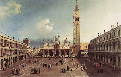
Anyway this space is qualified as a communal space because since the old age it was used as a place to trade, swap things, discuss about politics and meet people. It was also the symbol of power and politics of the territory. It is recognisable because, generally it is an open space surrounded by buildings with a political value.

A famous example is Piazza San Marco, in Venice, Italy. (Piazza=square)
It is surrounded by the Ducal Palace

As reported above this space was born many years ago to satisfy citizens needs and obviously it is still today a public space. But by time, everything is changed and so people needs. Nowadays there are much more buildings and few communal spaces in which people can meet or these are to far to reach. This is why today architects are starting to integrate these kinds of space also in smaller dimensions. And this is what I'm going to show you through my research.


Piazza San Marco with the Basilica by Canaletto, 1730


Plan of Piazza San Marco, 1831

Friday, 6 December 2013

Communal spaces in residential buildings

After a lot of thoughts about what I would like to analyse more deeply, I finally decided what topic I would like to present. It's something very near to my previous and current architecture studies. Something that should guide every architecture, today and that, too frequently, is omitted.

Communal spaces in residential buildings: relating people through a designed space


"The dance" by Henri Matisse, 1909-1910

SOURCE: http://www.camminandoscalzi.it/wordpress/uomo-cielo-terra-la-danza-di-henri-matisse-2.html

To introduce this topic, first of all I'm going to introduce what is generally recognized as a communal space: Town Squares

Wednesday, 4 December 2013

Inspiration

In this last week I'm doing a lot of reserch to explain and develop my propose for the familiy house.After a lot of hand drawings and model making I'm quite sure about the functions and I'm starting to rotate and play with the shape that it is going to take on order to catch the best sunlight and most beautiful views. This, obviously, without cutting any tree but trying to make the most of their presence and make the house involve in the nature atmosphere. This kind of approach is very similar to the project for a house in Spain by NO.MAD architecture studio.

The form of the house tries to follow the layout of the forest taking care of not touching them. So the plan consists in a number of "fingers" through the trees. Even through the use of windows in different positions and with different shapes they try to make the most of this site, making the forest come inside the house. I really like this aspect of the project and, despite the layout of the forest is not similar to this one, I'm trying to do the same in order to have a link and a sort of dialogue with the surrounding landscape. Another difference of approach with this project is that I'm trying to develop the form of the plan according to the sun path and the most beautiful views from the site. In fact there aren't as many trees as in this project and the site has a long shape, not very good to develop the house since there are so many factors to keep in mind.


As you can see in the picture just above, the trees literally come in the house atmosphere and, through an accurate attention for locating windows and a precise choice for the colour inside the house, within it you are completely involved from what surrounds you. For what concerns the picture below, I realized that I'm going to obtain almost the same effect of a double perspective view. In my case, this happens coming inside the house, from the main entrance. This because I'm trying to locate at least each window in front of the singular entrance of each room. This kind expedient help to perceive the space in a different way, not like a box but like something open. This is possible just using the sun light and in a site like this, in which there isn't so much sun light, this expedient in much more important. Coming back to the issue about the entrence in my house, this splitting of view creates a very interesting situation. It's just up to me developing it in the best way.


"Casa Levene en El Escorial / NO.MAD" 08 Nov 2013. ArchDaily. Accessed 06 Dec 2013. <http://www.archdaily.com/?p=445022>

Sunday, 1 December 2013

Connection with the surrounding

Through my research I found out the project Studio Dwelling, in Madrid by cmA Arquitectos because at first I was intrigued by its shape and form, very similar to my design, despite the type of location is totally different.
The plan consists in two "crossing arms", taking the sunlight from different points of view; this creates also attenuation of light and fulfills the need for privacy in certain areas of the house.


On one side of where these two arms cross the studio has designed a wonderfull open space that links the house to the external garden, in a fascinating way, like grasping on it. And this has been done, not only by the use of vegetation but also digging in the ground to have an harder link to the garden. This excavation, although low, give the possibility to create seats on the edges and stairs to reach the real ground level. At the same time this give to people linving in the house a sense of protection and warm, due also to the use of wood. Furthermore the view from the living room facing on this place is more protected and intimate.
The long space of this external space gives the possibility to enjoy it in many possibilities and due to its position and the fact that it is digged in the garden, looks like an extension of the house.


"Studio Dwelling / cmA Arquitectos" 24 Sep 2013. ArchDaily. Accessed 15 Dec 2013. <http://www.archdaily.com/?p=428630>

Wednesday, 27 November 2013

Hiding and displaying at the same time

Since the first stage of my design process, during this design studio in Winchester, I was wondering how I could manage to locate the garage in the best way possible. Saying this, I mean that wherever I put the garage it looks located in a wrong position. This could be because of the light: for example in my case, since the entrance is just one and I can't change it, the more directed place whould have been putting the garage in the south part of the site. But in this way I can't locate places like the living room, dining room and kitchen in the south. So, why don't you locate it in the north part, giving up in having a direct access to the garege? I tried but in this way I was covering the most interesting and nice view from the site. The other problem was that I didn't want to make the family living in this house watching the car passing through the garden and stopping in front of them.

At the same time, analyzing more deeply the landscape of the site, I was trying to use and take the most from it, not only to link the building to this place and only this one, but also to obtain what I rally wanted for the house itself.
At the stage of my process I manage to find a possible solution looking among a lot of projects, even with totally different kinds of landscape and the MAVA's house by Gubbins Architects, together with the last project that I have described in the last post, helped me a lot.


Pablo Montecinos

Like it can be seen from the picture, the architects of this project did a sort of loggia for the entrance of the house, composed by two volumes. This entrance hosts the cars park and allow to hide them due to the presence of what looks like a massive volume just above it. The truth is that what we see like wood panels are not walls but work like a balustrade for the beatiful view to the sea. And even the wood paviment above the entrance makes the light come trough it. Just beside the open garage there is the entrance so it is quite hidsen and protected from winds and different waether conditions.
Despite the site is totally different from the kind of forest in which I'm designing the family house I was thinking to use the same kinds of materials that they used here: concrete and wood. Concrete because I think that it's the best for this kind of building related to different slopes and trees roots that can always contact the walls and push them. And the wood because, for me, it creates again a sort of junction with nature.


Gubbins Arquitectos


Pablo Montecinos


Gubbins Arquitectos


Pablo Montecinos